Why CSS Logical Properties Aren’t Ready for Use!
The new CSS logical properties module is one of the most important developments to have come to CSS in recent years. This module enables us to support all the directions that human languages are written in with the same CSS definitions.
At the end of 2018, I published the “New CSS Logical Properties!” article. At that time, I was sure that in 2019 we would start using this new feature. But I was wrong!
CSS Logical Support in Theory
The can-i-use website might lead us to think that browsers already support these properties and that they are ready for use:
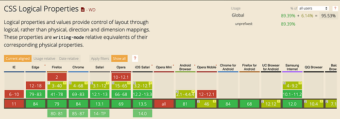
But make no mistake: CSS Logical Properties are still far from having good support!
Why is that, you might ask? Because this module involves many other properties — namely, every property that has a direction — and support for those properties and features ranges between having little to none at all.
What isn’t Supported in the CSS Logical Properties?
Because there are many topics that I want to cover in this article, I divided it into four categories, in decreasing order of importance: CSS Shorthand, Lack of Support, Responsive Design in Vertical Text Websites, and My Suggestions.
CSS Shorthands
When we use properties such as padding/margin, we usually write them using their shorthand form of two or more values. Since those properties have been part of CSS since the time when there were only physical properties (physical directions — top/right/bottom/left), there is no way for the browser to know if you want those values to refer to physical or logical directions.
Since physical properties were the first kind of properties on the Internet, they are the browser’s default, and thus far there still isn’t any way to tell the browsers to use logical directions.
margin: 20px 40px; /* vertical | horizontal */
margin: 10px 20px 30px 40px; /* top | right | bottom | left */
The W3C Suggestion
To overcome this problem, the W3C suggested adding the logical keyword. This keyword will signal to the browser that it should interpret the definitions as referring to logical directions.
margin: logical 20px 40px; /* block | inline */margin: logical 10px 20px 30px 40px;
/* block-start | inline-end | block-end | inline-start */
From my point of view, this is a hindrance when creating a fully logical website, because if you ever forget to write the logical keyword in a multi-language website, the website will break.
My Solution
Therefore my proposal, which I submitted to the W3C, is to add a new property calledflow-mode, which will affect all the shorthand properties that deal with directions.
html{ flow-mode: logical; } /* logical | physical (default) */.box{
   margin: 10px 20px 30px 40px;
   /* block-start | inline-end | block-end | inline-start */
}
Since this keyword will affect all the shorthand properties, we will no longer have to declare the logical keyword for every shorthand. Good, isn’t it?
Why can’t we have them both?!
But what if we want to change only one shorthand in a logical website into the physical shorthand?
Last week on the CSS Masters Talk show — a show in which we interview CSS specialists around the world — I spoke with Adam Argyle. When we talked about CSS Logical Properties, I realized that the truth lies in the middle: why can’t we have both?!
To have them both means that we need another keyword: the physical keyword. Using these two approaches, we can create, for example, a logical website where a physical shorthand is used in certain cases. For example:
html{ flow-mode: logical; }
.box{
   margin: 10px 20px 30px 40px;
   /* block-start | inline-end | block-end | inline-start */padding: physical 20px 25px 30px 35px;
   /* top | right | bottom | left */
}
I think this can solve all the shorthand issues and open up more possibilities for other features that don’t exist yet.
Lack of Support
In this category, we have CSS properties that have been updated but have very poor support. Most of them are supported only in the Firefox browser.
CSS Positions
The CSS Positions have gotten the new inset- properties that enable us to write according to the logical positions.
/* physical */
.cover{
   position: fixed;
   top: 0;
   right: 0;
   bottom: 0;
   left: 0;
}/* logical (new) */
.cover{
   position: fixed;
   inset-block-start: 0;
   inset-inline-end: 0;
   inset-block-end: 0;
   inset-inline-start:0;
}
This lack of support is a deal-breaker for creating a logical website in 2020. We can get along without shorthand, but we can’t get along without this feature in a logical website.
Another thing this feature gives us is the newfound ability to write shorthand for positions:
/* logical (new) */
.cover{
   position: fixed;
   inset: 0 0 0 0;
   /* block-start | inline-end | block-end | inline-start *//* if all equal you can write */
   inset: 0;/* many more options...*/
}
Float’s new values
The float property got the two new values, inline-start and inline-end, which are applied based on the direction property.
float: inline-start;
float: inline-end;
You might argue that CSS float is something that we shouldn’t be using in 2020, but I just want to remind you that the real usage of this feature is when floating text around images.
More features
There are some other features which are supported only in the Firefox browser at the time of writing this article:
- Border-radius’ new properties — all separated logical properties (example in MDN)
- Overflow’s new properties —
overflow-blockandoverflow-inline - Resize’s Property new values —
inlineandblock(resize in MDN)
Responsive Design in Vertical Text Websites
Everyone knows that responsive websites are styled according to the width of the browser window. But this isn’t always true when dealing with far-east languages.
The writing-mode property (which I wrote about in the “New CSS Logical Properties!” post) gave us the ability to support far-east languages, by having two main values:
vertical-rl(for traditional Chinese/Japanese and more)vertical-lr(for traditional Mongolian and more).
In these types of languages the text is written from top to bottom and the website’s main flow (the website’s scroll) is from right to left or left to right instead of from top to bottom. It is as if you took an English website and rotated it 90 degrees to the right.
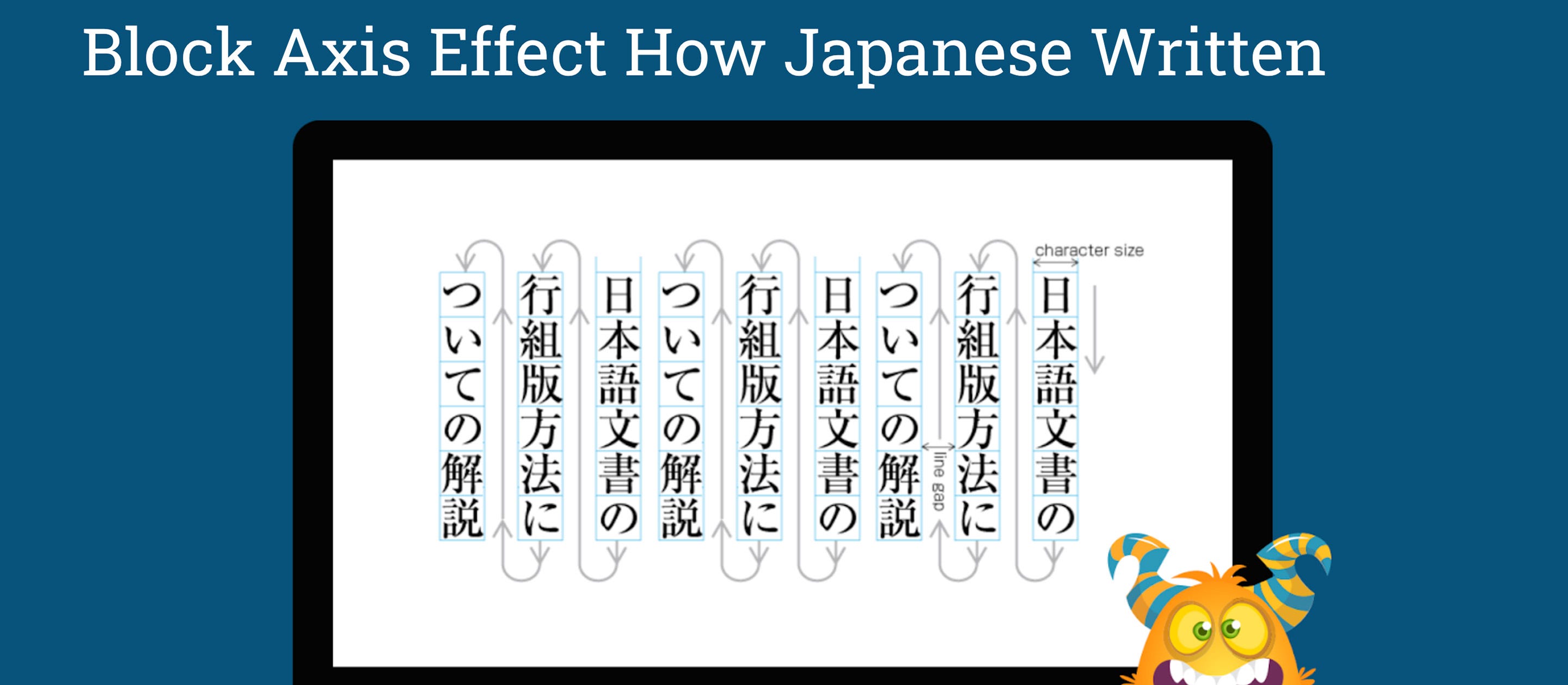
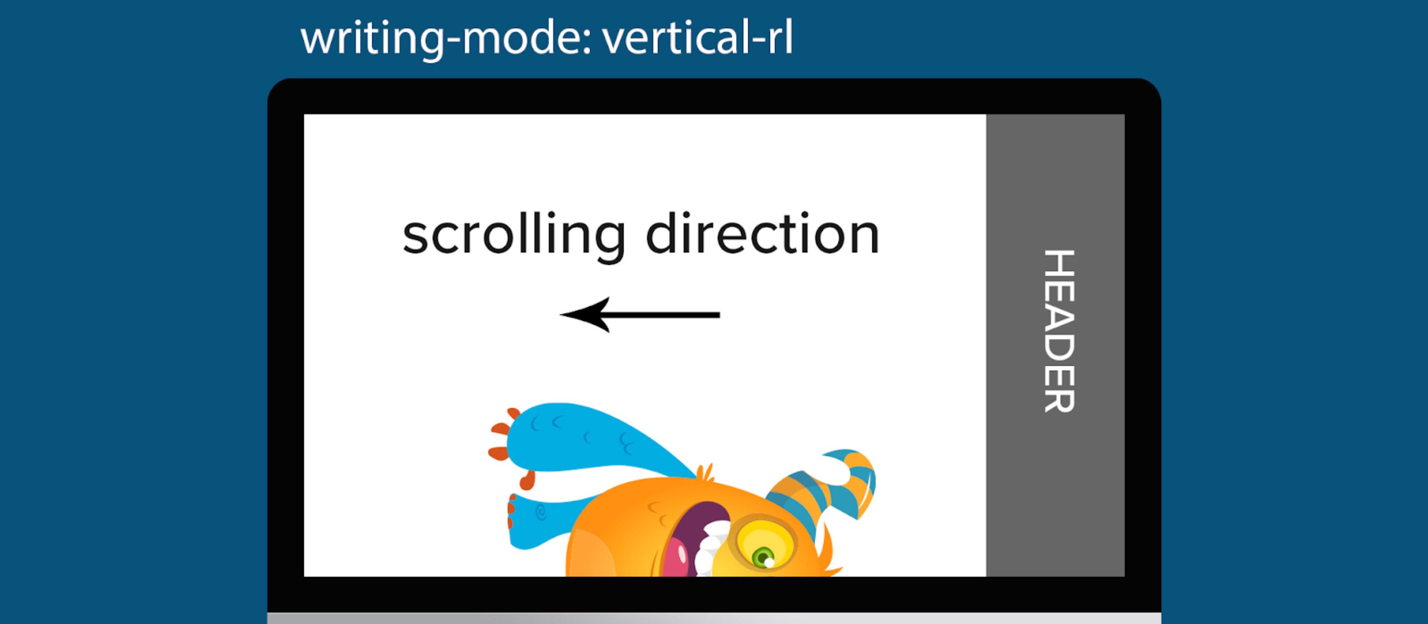
This means that the responsive design in this type of website should be based on the height of the browser and not on its width. In other words, it should be according to the inline-axis.
The solution for accommodating all types of language-directions is very simple: using the new min/max-inline-size in the media rule, instead of the old min/max-width properties. For example: @media (max-inline-size:1000px).
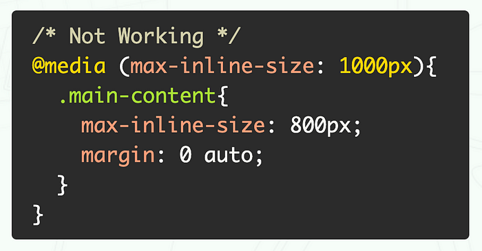
But this request does not appear to be understood, or perhaps is not important enough, maybe because these types of traditional languages are less used nowadays. We haven’t seen any progress since 2018, and don’t know if it will ever get any support.
My Suggestions
Because I live in a country whose language is not written in the usual direction (direction: ltr), I can think of additional ways to bring the CSS Logical Properties to other features in CSS. These are some of my ideas:
Transform
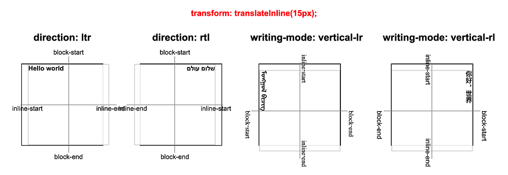
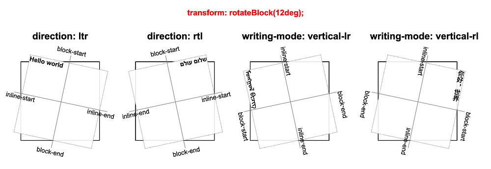
With the transform property, we move elements according to the physical x-axis and y-axis. Why not support the user in working with a logical axis?!
For these ideas I created visual examples:
transform: translateBlock(15px)

transform: translateInline(15px)
transform: rotateBlock(12deg)
transform-origin logical values
(block-start|block-end and inline-start|inline-end)

Shadow
Similar to transform, shadows work with the physical axes, the x-axis and the y-axis. In the same way, we can let users work with the logical axis: inline-axis and block-axis.
Because these properties already exist, we have to be careful not to break older websites on the web, and therefore we will have to use one of the suggestions that we discussed at the beginning of the article; how to declare logical for older properties:
- Global usage — with my suggestion of
flow-mode: logical - Local usage — the
logicalkeyword at the beginning of the value, like w3c suggestion.
Shadows type examples:
box-shadow

text-shadow
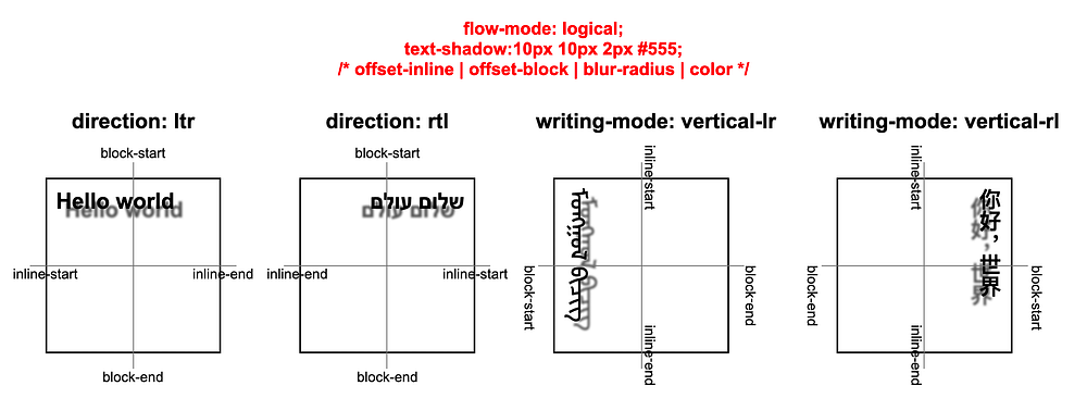
filter: drop-shadow

Background-position
When using a background-image on our website, we can apply physical positions to the image with the property of background-position and its physical keyword values top/right/bottom/left.
background-position: right top;Using the same concept, we can add logical positions and adjust the position of the background-image according to the language’s direction, with new logical keywords:block-start/inline-end/block-end/inline-start.
background-position: inline-end block-start;
Auto Rotate Content Images
Usually, images don’t need auto-rotating, but in some cases, the image/icon’s direction might have a meaning.
This idea is to add an attribute by the name of logical to the <img> tag. This attribute will tell the browser to update the direction of the image according to the direction of the language.
<img src="" logical>
Update Properties’ Names
There are properties in CSS that work according to logical directions but are written using a wrong naming convention. For instance:
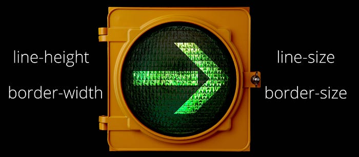
line-heightworks like line-width in vertically written languages. It’s time to update this property to a new name:line-size.border-widthis even more problematic because it behaves like a border-height when you look at the top/bottom border on regular websites, and the meaning of it was always the size of the border. It’s best to call itborder-size.
Final Words
CSS Logical Properties enable us to write CSS rules that apply to all the human languages’ reading directions at once, without having to create separate styles depending on the direction of a language.
The main purpose of this article is to raise our awareness to one of the most important topics in CSS. After all, the whole purpose of the internet is to share knowledge in every language regardless of its direction.
I’m quite sure that in the near future, when CSS Logical Properties get better browser support, we will all work only with them. Thus, we will have the advantage that the same styles on our website can support multiple languages out of the box.
More of My Content
I create a lot of CSS related content. Be sure to follow me on Twitter, Linkedin, and Medium.
You can also access all of my content on my website: eladsc.com.
Who Am I?
I am Elad Shechter, a Web Developer specializing in CSS & HTML design and architecture.

