Understanding the Difference Between CSS Resolution and Device Resolution
During my work as a web developer I see many web developers struggling to understand how to handle the pixel unit in a world of high-density screens in the web browsers. These days, high-density screens and retina screens are on all mobile devices and on many other types of devices. That’s in addition to the many screen sizes we have to deal with: mobile, tablet, desktop screens and more.

These new high-density screens are a big pain in the neck for us web developers, because when we’re building a responsive website we don’t know how to relate to the screen resolution . From the standpoint of these new high-density screens, the understanding of what a pixel is, becomes unclear.
“A Pixel is Not a Pixel”
As said, we’re dealing with two types of resolutions: The first resolution is the real device screen resolution, and the second one is the CSS resolution measurable units. Let’s elaborate on them more extensively.
The New Age of the High-Density Screen
In the past, those two resolutions were exactly the same. But now, in the new era which started when the first smartphones became popular - with devices like iPhone 4 and Samsung Galaxy S1, which were the first high-density screens in the world — there are almost no smartphone screens in which the screen resolution matches the CSS resolution.
From that point on, high-density screens started to appear everywhere, and not only on smartphones. It got to devices such as tablets, like the generation 3 iPad (the New iPad) which was announced in 2012, and in the last few years high-density screens can be seen on almost every type of device: laptop screens and desktop screens with 4k screen and above began to show up. These days there is almost no similarity between Device resolution and CSS resolution.
What is the Real Difference between CSS Resolution and Device Resolution?
The CSS resolution is used for measurements in the CSS Rules, and the Screen Device Resolution is the actual number of pixels on the screen.
Besides the two resolution types, there is also Density Display, which defines the ratio between the Screen Resolution and the CSS Resolution, and is different in high-density screens.
For example:
- In the iPhone 11, for every CSS pixel we have 2 device pixels, which means the density display is 2x.
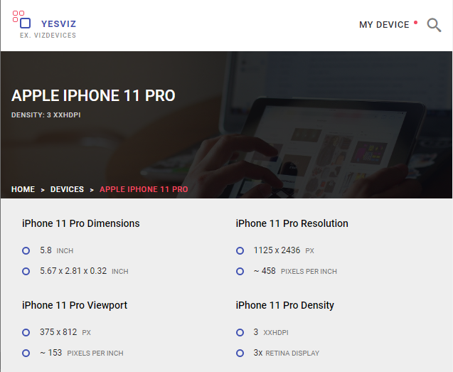
- In the iPhone 11 Pro, for every CSS pixel we have 3 device pixels, which means the density display is 3x.
- In the Samsung Galaxy S10, for every CSS pixel we have 4 device pixels, which means the density display is 4x.
Example:
Samsung Galaxy S10 Resolutions:
Device Resolution — 1440px by 3040px
CSS Resolution — 360px by 760px
Density Display — 4x (4 times for every pixel)

Why Isn’t a CSS Pixel Equal to a Device Pixel?
If during all those years before the high-density screen age, CSS pixels and device pixels were the same, why did the web industry create a difference between them?
The answer to that is very simple, because it had to! And why did it have to? Let’s take for example a device like the Samsung Galaxy S10, whose device screen resolution is 1440px by 3040px. This is the same resolution as that of a regular laptop screen, but it’s displayed on a small-sized device. If we didn’t have this difference between CSS Resolution and Device Resolution, the desktop website would appear in its full width on the mobile device, and we couldn’t create a real responsive website because we wouldn't have any way of differentiating between the styles that should affect the mobile site and the styles that should affect the desktop.
If We Don't Use the Device Resolution, What is its Purpose?
We’ve concluded that we use the CSS Resolution for measurement units in our CSS. When, then, do we refer to the Device Resolution?
The purpose of device resolution is for screen media, images, and videos.
With the extra pixels of those high-density screens, we can provide those devices with higher-density images and videos, and thus create a sharper view of those media. And yes, it means that in the Samsung Galaxy S10, for example, for an image aimed at CSS resolution of 300 pixels, you can load an image with up to 1200 pixels! Example:
<img src="image-size-1200px" width="300" alt="">If this topic of supporting high-density screens for images and for responsive images interests you, you can read my previous article, The “Complete Guide to Responsive Images!”.
How Can We Find Out What the CSS Resolution Is?
When you read device specifications, you’ll notice that they’ll usually display only the device resolution info. That is really frustrating for junior web developers who want to understand what the CSS resolution is for each device.
Nowadays, however, you can easily find this information using Google. By searching for the magic words: DEVICE-NAME + “CSS resolution” you’ll be offered two websites: the first and the more updated one is Viz Devices. The second is My Device which is less updated but displays the info a little bit more nicely. Both the sites show all the device’s details: the device resolution, its CSS resolution (Viewport), and the density screen ratio.
An Example of the iPhone 11 Pro Resolution Info, as shown on Viz Devices
Playing with, and seeing some types of devices, will gain you more understanding of this big huge world of screen devices.
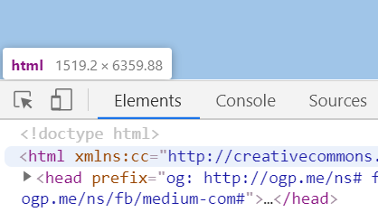
For desktop screen, the best way to know what is the CSS width resolution, is to do inspect element on the main root<html> element, while the browser is fully size open, and to see what it size it display back.
Final Words
That’s all.
I hope you’ve enjoyed this article and now you better understand the difference between Device resolution and CSS Resolution.
If you like this post, I would appreciate applause and sharing :-)
You can follow me via Twitter.
More of my CSS posts:
Complete Guide to Responsive Images!
The New Responsive Design Evolution
Who Am I?
I am Elad Shechter, a Web Developer specializing in CSS & HTML design and architecture. I work at Investing.com.

You Can find me in my Facebook groups:
CSS Masters
CSS Masters Israel
