Say Hello to Background-Origin and Background-Clip, CSS New features!
Learn Something New in CSS (Series)
Hello everybody, in this protip we will talk about two new extended properties that have been added in CSS3 to the background property.

(This post was originally published in June 2013, and updated because It’s still relevant today)
background-origin
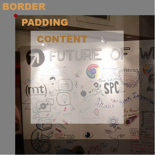
Before this property came along, whenever we would add a background-image to an element, that image would be positioned at the left top corner of the padding of our element.
As this image shows, when the background-position was set to 0 left,0 top, you could see the background-image starting on the edge of the padding area (marked by the red dot).

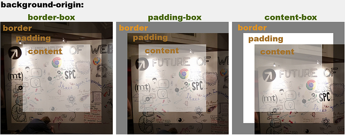
The background-origin lets you decide where you want the background-position starting point to be set: on the border, padding or content.
The new property of background-origin has 3 possible values according to the box-model:
- border-box — a background position of 0,0 will place the image at the top left of the border.
- padding-box(default) —a background position of 0,0 will place the image at the top left of the padding.
- content-box — a background position of 0,0 will place the image at the top left of the content.

In the upper screenshot/example you can see the influence of the background-origin values.
background-clip
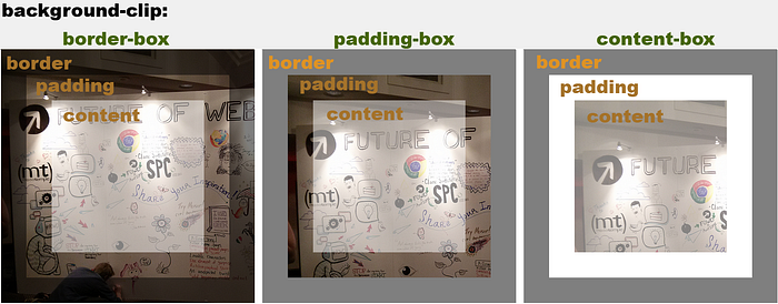
As you can see in the last example, the background-origin is nice, but something is still missing. The image is positioned according to the background-origin, but it spills over the right/bottom of the border/padding.
Background-clip is the answer! Using background-clip, we can decide where to cut the background-image, in the same way we set the background-origin values.
The new property of background-clip has 3 possible values:
- border-box(default) — show the full image, don’t cut anything.
- padding-box — cut the border background-image.
- content-box — cut the border and padding background-image.

As you can see in the last example, background-origin and background-clip work well together, and most of the time you will use both with the same values. For example, let’s say you use both with the “content-box” value for positioning the background-image over the content and clipping the background image at the padding and the borders.
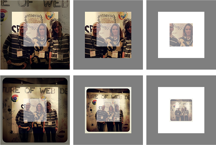
You can also make nicer things with this property. for example: I centered the background image and in the first row I kept the full background-size and played with the background-origin and background-clip simultaneously. In the second row of this example, I stretched the background-image size to fit the entire box using the background-size property and played again with the background-origin and background-clip properties simultaneously.
Screenshot results for this example

As you can see, you can create some nice stuff with these two new features.
That’s all for background-origin and background-clip.
Support
- Works in all browsers.
- IE — works from IE9 and above.
If you liked this post, you may also like:
- The New Background Position in CSS3
That’s all,
I am Elad Shechter, Web Developer specializing in CSS & HTML design and architecture, working at Investing.com.
You can contact or follow me:
My Twitter
Facebook
LinkedIn
You Can find me in my Facebook groups:
CSS Masters
CSS Masters Israel
