Complete Guide to Responsive Images!
A responsive image is one whose size responds to changes in screen resolution. The concept of responsive images was triggered by the need to solve issues such as serving different image sizes to different devices, and manifested into using that flexibility for things beyond sizes, such as art direction, image types, and more. The responsive images specification was created only after the responsive design came along.

As time went on, many ways of implementing responsive images have been added, and those additions, while broadening the front-end developers’ toolkit, have also made using responsive images quite complex. That’s why, even though the technology has existed for quite a long time, I only recently decided to dive into this topic. And that complexity is also the reason that as I proceeded in the dive, I realized that every source I read had something missing in it, and wasn’t showing the whole picture (pun not intended).
After reading and studying many resources, I decided to write a definitive guide of my own, hopefully including in it all the methods there are for implementing responsive images, and all the information needed in order to understand them, thereby making it the Complete Guide to Responsive Images.
A Short Intro to High-Density Screens
Before we jump into all the methods of implementing responsive images, there is an important concept we must understand about the pixel unit on the web: We tend to think that in mobile devices, the loaded images should be smaller since the devices’ width is smaller. But that isn’t always true.
“A Pixel is Not a Pixel”
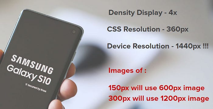
There is a difference between CSS Resolution and Screen Resolution: The CSS resolution is used for measurements in our website, and the Screen Resolution is the actual number of pixels on the screen. These days, this difference exists in all mobile screens and on some desktop screens.
Example:
Samsung Galaxy S10 Resolutions:
Device Resolution — 1440px by 3040px
CSS Resolution — 360px by 760px
Density Display — 4x (4 times for every pixel)

That means that if, for example, you have an image that is 300 pixels wide, you can load an image that is up to 4 times wider (1200 pixels wide), and actually see a sharper image!
We tend to think that in mobile devices, the loaded images should be smaller since the devices’ width is smaller. But that isn’t always true.
But beware: serving a larger image comes at a price. Larger images load slower, and this slowness intensifies in mobile devices because internet speed on them is rather limited. So you must weigh the pros and cons and decide when the image sharpness is worth the lag in the image’s loading time.
In this post, I will describe eight methods for implementing responsive design. The first two use the <img> element and the srcset attribute; the next two use the <picture> element; the following two use CSS: one uses the image-set attribute and the other uses media query properties for responsive design (the min-resolution and the max-resolution); the last two are CSS future features using a CSS function called image().
The reason there are so many methods is that there are a few problems to solve in responsive design: serving smaller images to narrower screens; taking advantage of screen density; changing the image’s focus in different resolutions; using image file types that aren’t supported by all browsers.
Now we can dive into our responsive images methods:
The Display Density Descriptor Method
This method is suited for images with a fixed image size in high-density screens. It means that on some screens, for an image whose CSS/HTML actual size is 200 pixels, we can load a 600-pixel — or higher width — image, because the screen’s high density will display it better.
To implement this method, we use the new srcset attribute with the display density descriptor. We will define the srcset attribute with an array of images of different sizes, and at what screen-density each size should be displayed. The display density descriptor describes how much denser the resolution should be when using each image size: 1x, 2x, 4x, etc.
Notice! The display density descriptor will choose the image according to the screen’s pixel density, and not the image’s actual size.
It’s recommended to still use the regular src attribute because of browsers that don’t support srcset, like IE and Opera mini.
<img src="cat-200px.jpg" alt="sugar free cat" width="200"
     srcset="cat-200px.jpg 1x,
             cat-400px.jpg 2x,
             cat-600px.jpg 3x,
             cat-800px.jpg 4x">
A live Example of Pixel Density Descriptor on CodeSandBox
The Width Descriptor Method and the Size Attribute
This method is suited for images whose width changes according to the viewport size and our responsive breakpoints. This case is the most common in responsive websites.
Srcset Attribute with Width Descriptor
In this method, we define the srcset attribute with an array of images, and what width each image should be displayed at (we must supply the width because the browser doesn’t ‘know’ the image’s actual width). This method, when used alone without the sizes attribute, is based on the browser’s assumption that the image’s width should fill the viewport width.
This method is a little similar to the Density Descriptor method in that it uses the srcset attribute with an array of images and the conditions by which to display each image. But it’s different in that the definition of when to use each image in the array is based on the image’s width and not the screen density. That is, it uses the width descriptor (the width we want the image to have) and not display density descriptor. but it will relate to high-density screens.
Note: Even though it uses the width descriptor and not the display density descriptor, the browser still takes high-density screens into account.
The Sizes Attribute
Apart from giving the browser the list of images with the width descriptor (using the srcset attribute), we need to provide the browser with the image’s size compared to the browser screen, and for that, we have the sizes attribute.
The sizes attribute is an array of Media conditions with an image size for each condition. (Note: The amount of Media conditions is not necessarily equal to the number of images in the array, as you’ll see in the following examples.) In addition to the media conditions, we also must provide, as the last item in the array, a width value that has no Media condition. This value will be our fallback if none of the Media conditions are met.

Image Size Condition — there are 3 common unit usages: the vw unit, the px unit, and a combination of them using the calc function, for example, calc(30vw + 300px).
A complex condition example:
sizes="(max-width: 399px) 50vw,
       (min-width: 400px) and (max-width: 900px) calc(30vw - 40px),
       100vw">
In a regular responsive website, sizes will usually have only one condition and a fallback, and srcset will have multiple combinations of image sizes and widths:
<img src="cat.jpg" alt="cat on a watermelon"
     srcset="cat-200px.jpg 200w,
             cat-400px.jpg 400w,
             cat-600px.jpg 600w"  sizes="(max-width:800px) 30vw,  600px">
After giving the browser the srcset array of images and the CSS image’s actual sizes per Media condition, the browser will choose the right image after taking all those parameters into account. And don’t worry, in high-density screens, the browser will choose the image according to the real Device pixel ratio.
<Picture> Element
Up till now, we’ve only talked about the <img> element, and in most cases that will be enough, because the <img> element with the srcset and sizes attributes will get most of the job done. But the <picture> element has ways of implementing responsive elements too, and the next two methods will use it for these more complex cases:
<picture> Art Direction Method
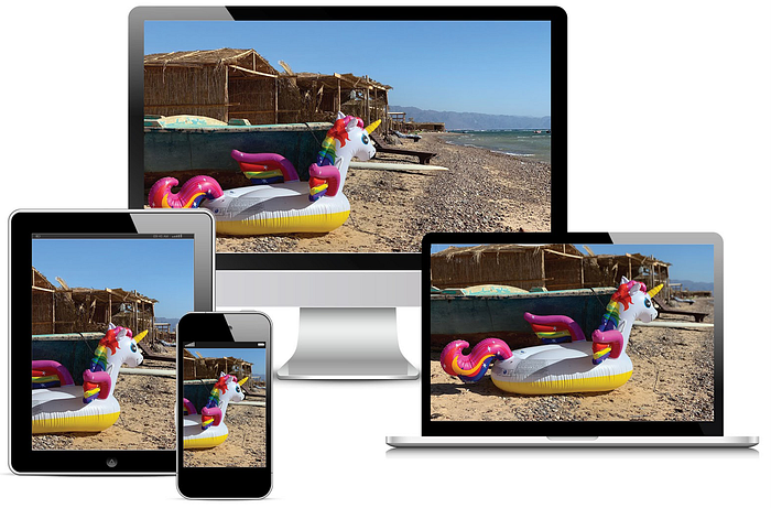
The Art direction method is a way of serving images with different ratios or different focus points, to different devices. With the <picture> element, we can load a different source depending on the Device CSS width of the screen. This way you can choose the same image with a different cut, and thereby focus on the meaningful part of the image in smaller screens.

How Does the Art Direction Methods work?
Inside the <picture> element, we use the <source> element. In each <source> element we define 2 attributes: media and srcset. The media attribute’s value is a media query, the same as regular responsive design media queries, and for each media query condition, a srcset attribute is defined.
We can add as many <source> elements as we need.

After all the <source> elements, we add a regular <img> element. The addition of the <img> element is essential because without it, the picture image will not work. In addition, there are other important reasons for adding the <img> element:
- If the browser does not support the
<picture>element, the<img>element will be used (this is the case in IE & Opera mini browser for example). - If none of the
<source>elements is targeted, the browser will use the<img>element. - The
altattribute for accessibility can only be added to the image element.
The order in which the <source> elements are written is important because the browser will choose the first source that works. Here is an illustration of how it works:

Full HTML Example:
<picture>
   <source media="(min-width:600px) and (max-width:1200px)"
           srcset="images/sinai-medium-screen.jpg">   <source media="(min-width:1201px)"
           srcset="images/sinai-large-screen.jpg">   <img src="images/sinai-small-screen.jpg" alt="Unicorn Pool Float">
</picture>
The Famous Cat experiment with the Art direction method, made by Google, when the <picture> element came to chrome 🙂

<picture> for Image Types Method
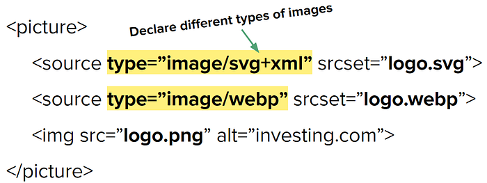
Another usage of the <picture> element is when using types of images that aren't supported by all browsers. For example, Google developed a new type of compressed images called webp. Webp isn’t supported by all browsers - for example, IE & Safari don't support it. And here again, the <picture> element comes to the rescue but in a different variant.

In this case, we use the new attribute type on the <source> element. Every type attribute will target a different image, by combining it with the srcset attribute. Just as in the examples above, the order in which the <source> elements are written is important because the browser will choose the first source that works, and if none of the sources work, it will use the <img> element as a fallback. Here is an illustration:

<picture>
   <source type="image/svg+xml" srcset="logo.svg">
   <source type="image/webp" srcset="logo.webp">
   <img src="logo.png" alt="investing.com">
</picture>
There are many image types, and you can find the common use cases at Mozilla or the Full list of image types.
Responsive Images in CSS
So far, all we used to create responsive images was HTML. In most cases, this is definitely enough, but there are two features of responsive images in CSS you should be familiar with.
The image-set function
The image-set function’s parameter is an array of pairs of images and densities, similar to what’s supplied in the srcset attribute in The Pixel Density Descriptor Method. The browser will choose the image according to the screen density.
background-image: image-set( url("bg.png") 1x,
                             url("bg-2x.png") 2x );
Notice: image-set came earlier than srcset and hasn’t been updated, and it also lacks the width descriptor feature. Therefore the browser chooses the image only with regard to the screen’s density and not to the actual image size!
image-set browser support
It seems that this feature has been forgotten — some browsers don’t support it at all, and some still need the -webkit prefix. To fully target all browsers, you should use it like in this example:
background-image: url("bg.png"); /* IE / Edge / Firefox *//* Chrome & Opera */
background-image: -webkit-image-set( url("bg.png") 1x,
                                     url("bg-2x.png") 2x);background-image: image-set( url("bg.png") 1x,
                             url("bg-2x.png") 2x);
Density Media Queries
There are two media query properties for responsive design: the min-resolution and the max-resolution. They too, like image-set, are suited for cases where you want the image to change according to the screen density. The difference between this method and the image-set function, however, is that here you can use any styles you want.
Notice: The Safari browser uses the property’s old syntax, with the webkit prefix: -webkit-min-device-pixel-ratio & -webkit-max-device-pixel-ratio. To support all browsers you will need to use them both. Example:

Full example of responsive screen density test on CodePen
Future Features for Responsive Images
CSS Art Direction with the Image() Function
As we saw in the “Picture art direction method”, there are cases in which we want to crop the image differently, depending on the CSS viewport width size. As opposed to that method which was in the HTML, there is a specification for cropping images using CSS!
The feature is implemented by the image() function. Its parameters are an image url and four numbers: start X position, start Y position, width, and height.
background-image: image('myimage.webp#xywh=0,20,40,60');What makes this a better implementation than the “Picture art direction method”, is that the former method uses different images, each cropped differently, while this method enables us to use the same image, cropping it differently using the CSS image() function.
CSS for Image Types Method
As we saw with the “Picture for Image Types Method”, there are cases in which we will want to load different types of images, depending on their browser support. This feature, too, has a CSS specification, and it too, uses the image() function, although with a different syntax. Here, when using the image() function, we can give it an array of images of different types, and the browser will go through them in the order in which they’re written, and use the first image type it supports.
.help::before {
  content: image("try.webp", "try.svg", "try.gif");
}
Unfortunately, for the time being, these new features have zero support. You can find more info on them on the Image function page at Mozilla.
Final Words
That’s all.
I hope you’ve enjoyed this article and learned from my experience.
If you like this post, I would appreciate applause and sharing :-)
You can follow me via Twitter.
More of my CSS posts on Responsive Design:
The Difference Between CSS Resolution and Device Resolution — NEW!
The New Responsive Design Evolution
Who Am I?
I am Elad Shechter, a Web Developer specializing in CSS & HTML design and architecture. I work at Investing.com.

You Can find me in my Facebook groups:
CSS Masters
CSS Masters Israel
